Trust-centered service design for non-emergency pediatric decision support
Role: UX Researcher (Qualitative, applied) · Team Project
When a kid has a fever at 2am, parents panic. They Google symptoms, call family, spiral. We talked to parents about what would actually help them feel less scared - and it wasn't another symptom-checker app.
This was a team project in grad school. We didn't ship anything - it was conceptual. But the research was real. We talked to actual parents about actual moments of panic, and what we heard changed how I think about healthcare UX.
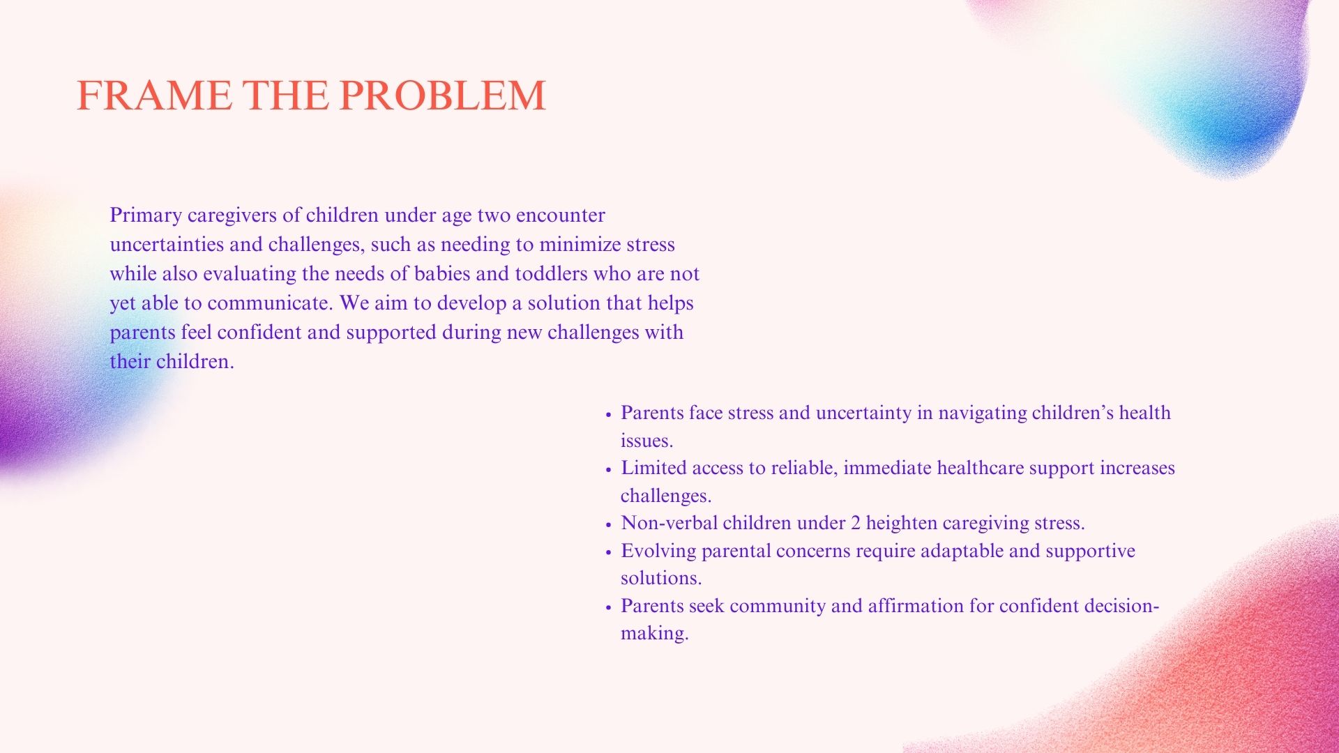
Parents don't trust the random health advice they find online. They're anxious, overwhelmed, and just want someone to tell them "it's fine" or "go to the doctor." But getting that reassurance is surprisingly hard.
I led the research piece: designed the interview guide, talked to parents, mapped out their journeys. Then I worked with the team to turn those messy, emotional stories into something we could actually design around.
One interview stuck with me. A mom described Googling "baby rash dangerous" at 3am, getting 47 different answers, and just crying. That's not a UX problem you solve with better information architecture. That's a trust problem.
Semi-structured interviews, mostly. I asked parents to walk me through the last time they worried about their kid's health. Not hypotheticals - real moments. The specificity mattered.
Then we mapped those stories: where did they go first? What made them trust (or distrust) what they found? Where did they give up? The patterns were surprisingly consistent.
Parents didn't want more information - they wanted a person. Someone who could listen, understand the context, and say "here's what I'd do." That changed our whole approach from building a content library to designing human connections.
We started with the assumption that parents needed better information. They didn't. They needed someone to talk to.
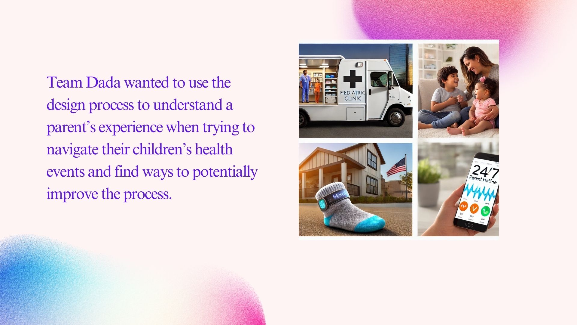
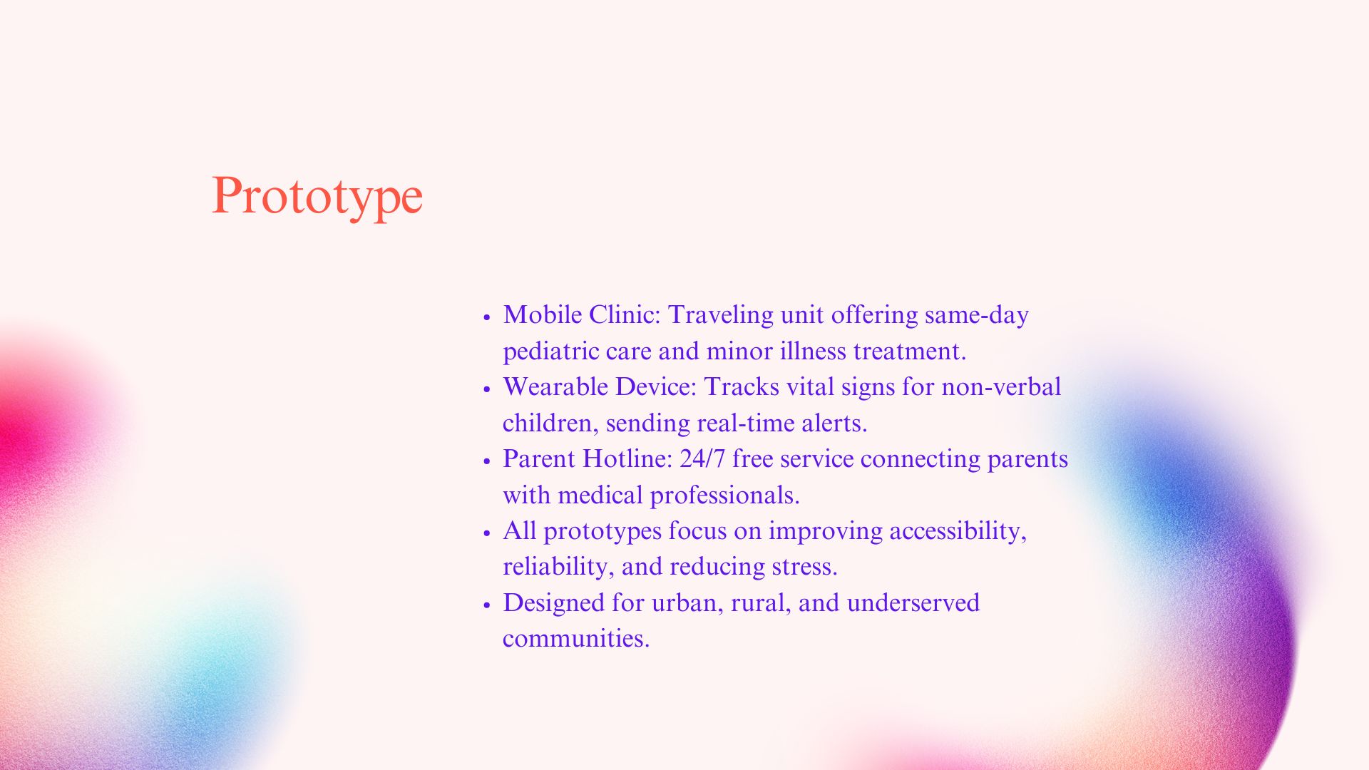
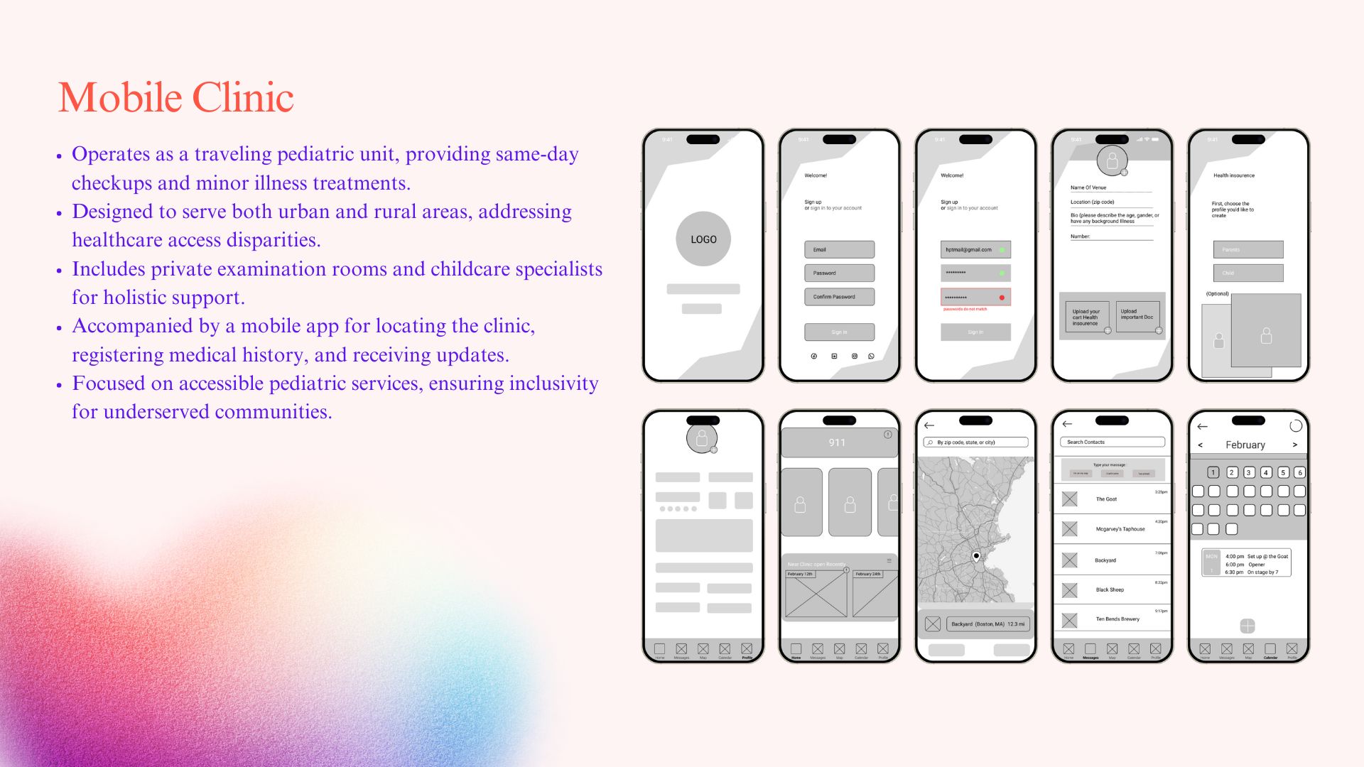
That shifted our entire approach. Instead of designing another symptom-checker or content library, we focused on services that connected parents to real people: a 24/7 hotline to nurses, mobile clinics for underserved areas, an app that prepped parents before doctor visits.
None of these were revolutionary ideas. But the research gave us permission to prioritize human connection over feature lists.
Design Concepts (Team Prototypes)
The team explored service concepts informed by research:
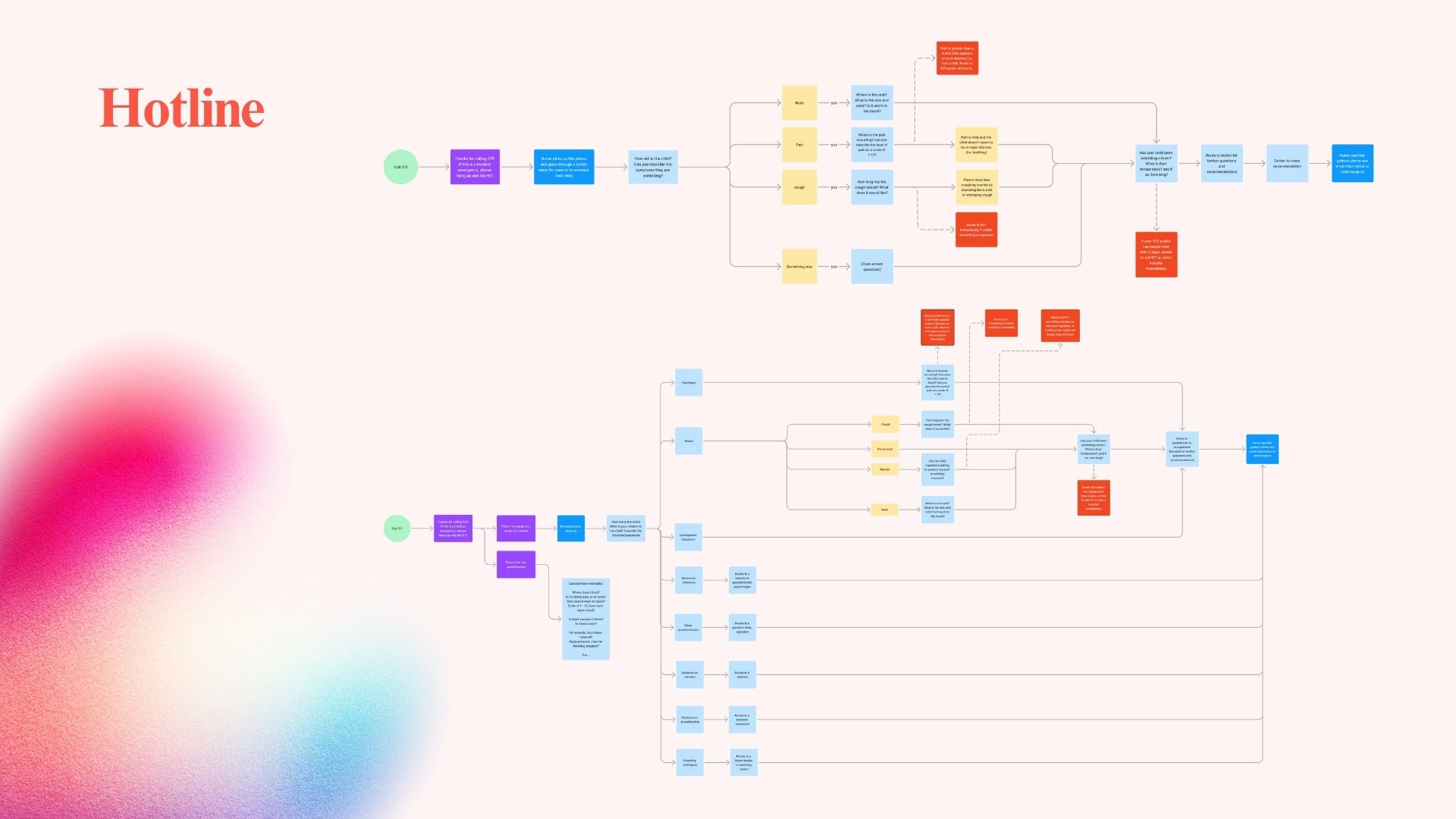
24/7 Parent Hotline - Phone and text access to nurses and pediatric professionals
Mobile Pediatric Clinic - Pop-up clinics for underserved urban and rural areas
Companion Mobile App - Appointment context, location, and medical history intake
Concepts prioritized accessibility, clarity, and trust over feature complexity.
Project Visuals
Research & process
Caregiver journey and trust mapping from parent interviews - surfaced where trust broke down and where clarity was missing.
Concept & synthesis
Thematic synthesis and early service concept framing; aligned the team on trust-centered, human-supported care.Service concept artifact from research synthesis; made caregiver needs and touchpoints explicit for the team.
Prototype & outcome
Low- or mid-fidelity prototype (Figma/Canva); made the concept testable and clarified the caregiver path.Final concept or presentation of research and design outcomes; communicated value of trust-centered design and caregiver support.