Inclusive AI-powered UX research for international students
UX Research Lead · Academic Research Project
International students at Drexel were frustrated with the university portal. I spent months interviewing them, running usability tests, and figuring out what was actually going wrong. The biggest surprise? Translating the interface made things worse, not better.
This started as my thesis project, funded by a small grant. I had access to real students, a tiny dev team, and not much time. The students I was working with spoke Farsi, Spanish, Chinese - and they were all struggling with the same portal in different ways.
Honestly, I went in thinking translation would be the fix. I was wrong.
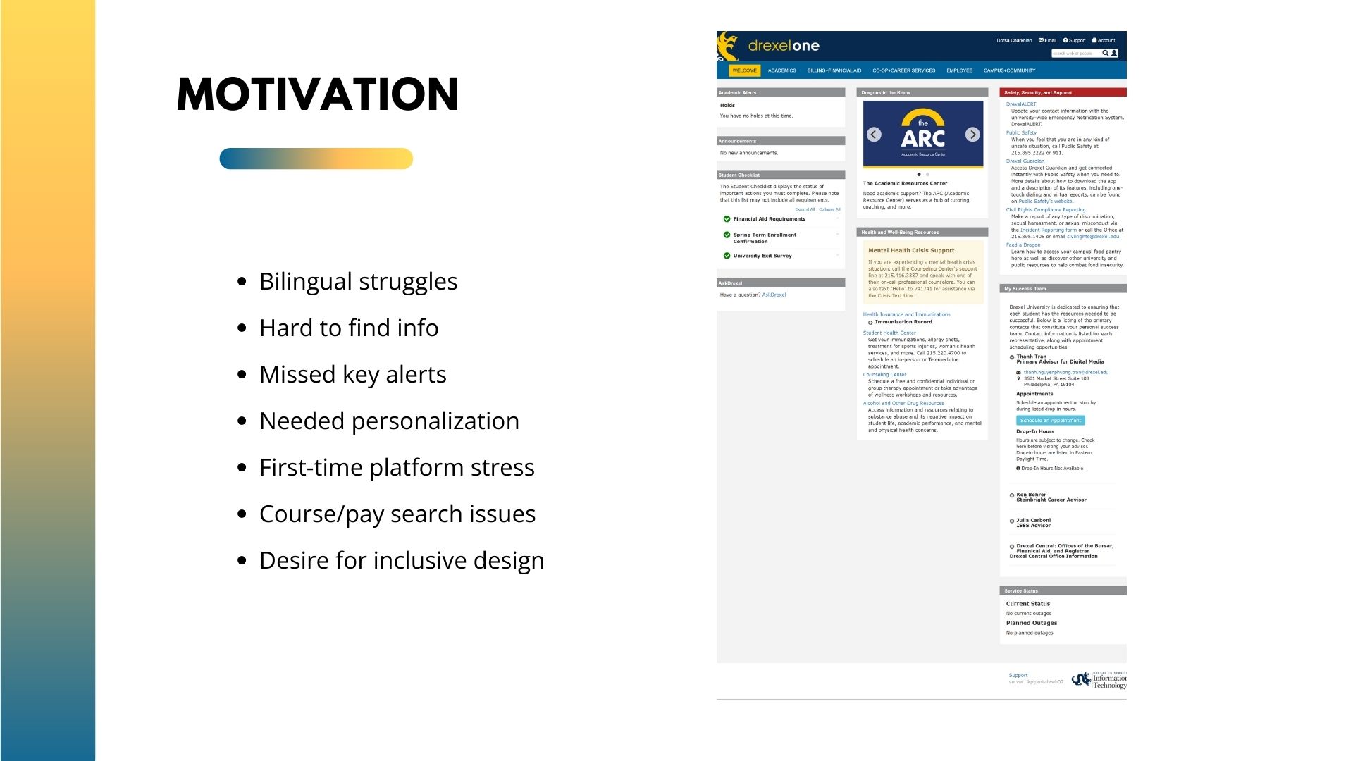
Early research highlighted language barriers, information overload, and onboarding stress for international students.
Students kept getting lost in the portal. They couldn't find what they needed, gave up on tasks, and felt stupid - even though the problem wasn't them. It was the system.
I ran the research end-to-end: wrote the grant proposal, recruited students, conducted all the interviews and usability tests, then worked with designers and developers to actually build something. A lot of back-and-forth. A lot of "wait, that's not what the research said."
The hardest part wasn't the research itself - it was convincing the team to trust findings that went against their assumptions.
I talked to 30 students, one-on-one. Asked them to walk me through common tasks while thinking out loud. Watched where they paused, where they gave up, where they said "I don't understand this."
Then I ran A/B tests with 50 more students to see if our changes actually helped. Some did. Some made things worse. We iterated.
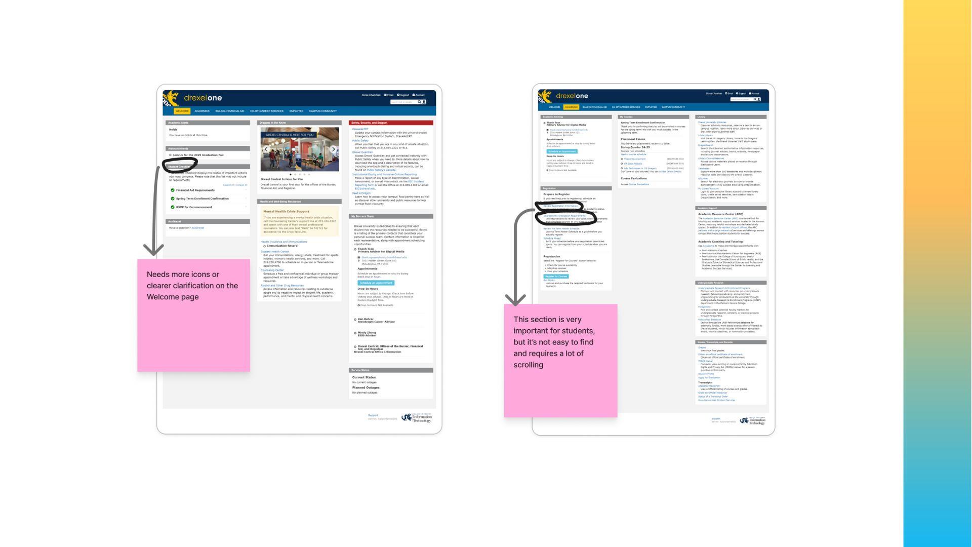
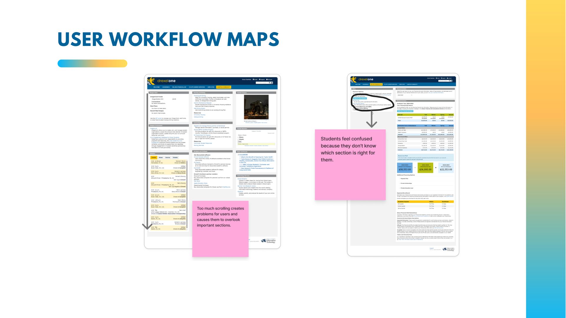
User workflow mapping revealed confusion caused by deep navigation, unclear labeling, and excessive scrolling.
This one surprised me: translating the interface word-for-word made students more confused, not less. The terms didn't carry the same meaning in different languages. We had to explain concepts, not just translate words. That insight changed everything about how we approached the redesign.
The original plan was to translate everything. The research killed that idea. Students didn't need Persian or Spanish versions of confusing terms - they needed those terms explained in plain language.
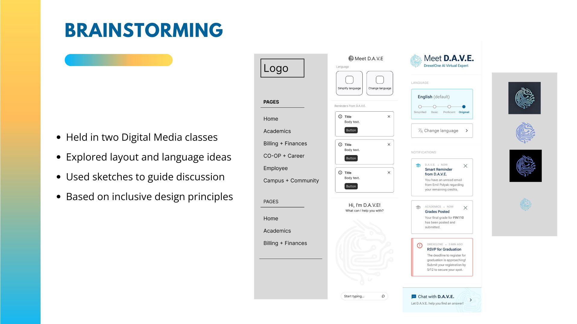
So we built D.A.V.E. - an AI assistant that could answer questions in context, not just translate words. We also flattened the navigation and rewrote the labels to be clearer for everyone, not just international students.
The A/B tests confirmed it worked. But honestly, watching students actually complete tasks without getting stuck was more convincing than any metric.
Early D.A.V.E. concept exploration focused on simplified language, personalization, and AI-assisted guidance.
AI can help people feel less lost - but only if you actually understand what's confusing them in the first place. The technology isn't the hard part. Listening is.
Figma· Miro· Cursor
See the Project in Action
Short walkthrough of the master's thesis prototype and research-driven design decisions.